How to Build a Technical Blog Visual System Without the AI Look
A practical system for making technical blog visuals feel editorial, useful, and human instead of repeating the same generic AI illustration.
Table of Contents13 sections
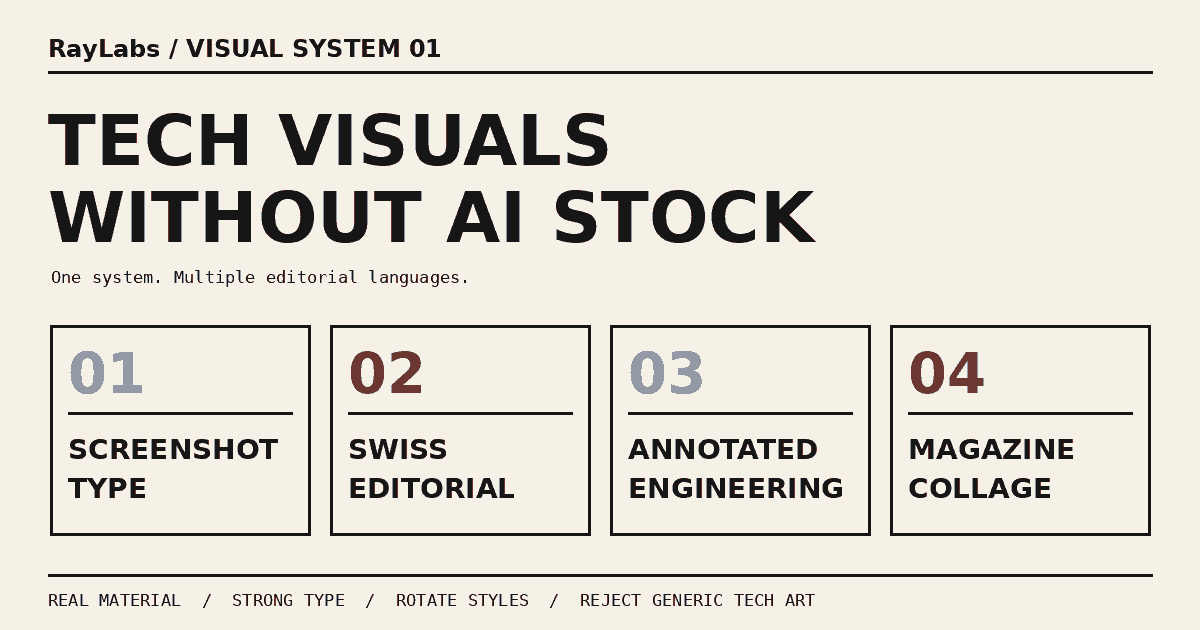
Technical blogs have a strange visual problem right now. It is easier than ever to generate a polished hero image, but it is also easier than ever for that image to look interchangeable with thousands of other AI generated covers.
The pattern is familiar. A glowing laptop sits on a perfect desk. Blue and purple light connects floating interface panels. A generic robot appears near a dashboard. Every surface is clean, every edge is rounded, and every illustration is technically competent but emotionally anonymous.
The problem is not that generated imagery is inherently bad. The problem is that a publishing system without an art direction will keep choosing the safest visual shorthand available. Over time, every article starts to look like the same article.
A better approach is to treat visuals as a system instead of a prompt. The system defines which visual families are allowed, when each one is useful, what should never be used as a default, and how to keep consecutive posts from collapsing into the same look.
This guide explains how to build that kind of system for a technical publication.
Start With the Job of the Hero Image
A hero image is not decoration. It has at least three jobs.
First, it gives the article a recognizable identity in a feed. Readers should be able to distinguish a debugging guide from a product essay before reading the title closely.
Second, it sets expectations. A screenshot-heavy cover suggests a practical walkthrough. A technical manual style suggests engineering depth. A magazine collage signals a more editorial or reflective article.
Third, it creates continuity across a publication. The images do not need to look identical, but they should feel like they came from the same editorial desk.
That last point is where many automated publishing systems fail. They optimize each image in isolation. The prompt asks for something relevant to the topic, the generator produces a competent image, and the pipeline ships it. No part of the process asks whether the previous three covers used the same composition, lighting, or visual metaphor.
The fix is simple in principle: the visual decision needs memory and rules.
Build a Style Pool Instead of One House Style
A single rigid house style sounds consistent, but it often becomes boring. If every article uses the same dark gradient, same frame, same typography, and same device mockup, the publication becomes visually flat.
A better system uses a controlled style pool.
For a technical blog, a useful pool might include:
- screenshot plus typography;
- Swiss editorial layouts;
- annotated engineering screenshots;
- newspaper or magazine collage;
- physical paper and cutout compositions;
- real product screenshots;
- code as artwork;
- editorial photography;
- brutalist tech posters;
- retro technical manuals;
- archive or Xerox treatments;
- risograph or screenprint;
- data posters;
- monochrome line art;
- real object macro photography.
The point is not to use all of them equally. The point is to give the publishing system several legitimate visual languages so it does not fall back to one generic AI aesthetic.
Think of the pool as a design vocabulary. A good editor does not use every word in every sentence. The editor chooses the vocabulary that fits the idea.
Organize the Pool Into Tiers
Not every style should have the same probability.
A practical system can divide styles into three tiers.
Tier A contains the dependable defaults. These are flexible, readable, and work across many topics. Screenshot plus typography, Swiss editorial, annotated screenshots, and magazine collage are strong examples.
Tier B contains regular secondary styles. Physical paper, real product screenshots, code as artwork, and editorial photography create variety while staying close to the technical subject.
Tier C contains accents. Brutalist layouts, retro manuals, Xerox textures, risograph, data posters, line art, and macro photography can be memorable, but they are easy to overuse.
This structure solves two problems at once.
It prevents the system from becoming too conservative because Tier B and Tier C are always available. It also prevents the publication from becoming visually chaotic because the unusual styles are deliberately less frequent.
The result is controlled variation instead of randomness.
Match the Style to the Article Type
A style should not be selected because it looks fashionable. It should support the article’s promise.
For tutorials, debugging guides, and tooling articles, evidence is useful. Annotated screenshots, real product UI, screenshot plus typography, and code as artwork make the article feel grounded in actual work.
For architecture and system design, diagrams are useful, but they do not have to look like presentation slides. Swiss editorial layouts, technical manual drawings, monochrome line art, and data posters can explain structure without turning the hero into a stiff box and arrow chart.
For product thinking, AI strategy, and opinion pieces, the visual can be more interpretive. Editorial photography, magazine collage, Swiss layouts, and typography-led covers can communicate a point of view without pretending to show a literal system.
For practical automation and workaround articles, physical paper, annotated screenshots, collage, and brutalist treatments can make the process feel hands-on.
For hardware, Android devices, Macs, POS terminals, or physical tools, real photography and macro shots often work better than synthetic illustrations.
The decision should begin with the article type, not with the generator.
Prefer Real Material When It Exists
The fastest way to reduce the AI look is to stop inventing things that already exist.
If the article is about a real interface, use a real screenshot.
If the article is about a terminal workflow, use real terminal output.
If the article is about a device, photograph or capture the device.
If the article is about code, use actual code from the example.
If the article is about a metric, visualize the real number rather than drawing an abstract dashboard.
Generated elements can still help with framing, texture, background, or composition. But the visual becomes more credible when the center of gravity comes from material connected to the article.
A useful rule is to aim for roughly seventy percent real or directly article-derived material and thirty percent design treatment when the topic allows it.
That ratio is not a mathematical requirement. It is a reminder that design should amplify evidence rather than replace it.
The same principle appears in automation engineering. In How to Automate a SaaS Product Without a Public API, the durable part is not a clever browser trick. The durable part is the contract around the integration. A visual system benefits from the same separation: the article provides the source material, while the style layer decides how to present it.
Define Hard Avoids
A style system needs explicit negative rules.
Without them, an automated generator will eventually return to the most statistically common tech imagery. Relevance alone is not enough.
For a technical publication, useful hard avoids include:
- humanoid robots used as a generic symbol for AI;
- glowing pipelines with no explanatory meaning;
- floating glass panels that do not correspond to a real interface;
- random three dimensional cubes and server blocks;
- blue and purple neon as a default technology palette;
- laptops on perfect desks when the device itself is not part of the story;
- fake dashboards filled with tiny unreadable text;
- box and arrow diagrams that look like presentation placeholders;
- abstract circuitry used only to make the image feel technical.
These are not forbidden visual elements forever. They are forbidden as lazy defaults.
If an article is actually about robotics, a robot may be appropriate. If an article is about a network topology, a connection diagram may be useful. The rule is that the object must earn its place.
Negative rules are especially valuable in an automated system because they prevent regression. A human art director remembers that last week’s robot cover looked generic. A scheduler needs that preference written down.
Add Rotation Rules
A style pool alone does not guarantee variety.
Imagine a system with fifteen approved styles that keeps selecting screenshot plus typography because it is the safest choice. Technically, the system follows the rules. Visually, nothing changes.
Rotation rules solve this.
A simple policy can say:
- do not use the same style for two consecutive new articles when another approved style fits;
- track the visual family of recent posts;
- if the recent set is screenshot-heavy, prefer print, photography, collage, or data for the next suitable article;
- reserve highly stylized treatments for occasional use;
- allow a repeat only when the article genuinely demands it.
This is not randomization. It is editorial pacing.
A publication needs rhythm. Several practical tutorials can share a visual language, but the feed should still contain moments of contrast.
Rotation also makes the visual system easier to evaluate. If one style repeatedly performs poorly or feels off-brand, you can reduce its frequency without redesigning the entire publication.
Make the Style Decision Before Generating
Another common mistake is generating an image first and deciding what style it represents afterward.
That reverses the process.
The publishing pipeline should make a short visual brief before any image or layout work begins. The brief can contain:
article_type: engineering editorial
selected_style: newspaper / magazine collage
visual_goal: show variety without generic AI imagery
real_material: typography samples, code fragments, screenshot frames
avoid: 3D objects, neon, humanoid robots, fake dashboards
The generation or design step then has a narrow target.
This makes rejection easier too. If the output comes back as a glowing 3D workflow, the system can reject it because it violates the selected style and avoid list. It does not need to debate whether the image is “good.”
That distinction matters for reliable automation. A deterministic mismatch should be treated as a failed preflight, not as subjective uncertainty.
Treat Visuals as a Package With the Article
A publishing pipeline can create a beautiful hero and still fail in production if the asset metadata is wrong.
The article, hero binary, asset manifest, quality record, and final route should be treated as one package.
Once the final hero bytes are selected, derive the technical metadata from those exact bytes:
- file format;
- width and height;
- byte length;
- SHA256;
- public path;
- alt text;
- caption;
- asset ID.
Do not generate a manifest and then replace the image. Do not resize the image after calculating the hash. Do not update the article ID without updating the asset references.
The visual system is an editorial layer, but the asset contract is an engineering layer. Both need to succeed.
This is where a controlled visual system is useful for automation. The style can vary dramatically while the package contract remains stable.
Separate Authenticity From Photorealism
A visual does not need to look like a photograph to feel authentic.
A Xerox cover can feel more honest than a photorealistic render. A handwritten annotation can feel more human than a perfect glass interface. A simple code excerpt can carry more authority than a cinematic workstation.
Authenticity comes from specificity.
A specific error message, a real component name, a relevant screenshot crop, a meaningful annotation, or a recognizable workflow gives the reader something concrete.
Generic photorealism does the opposite. It can look expensive while saying nothing.
This is why styles such as retro technical manual, risograph, collage, and brutalist design can work well for technical writing. They are openly designed. They do not pretend to be documentary evidence.
The visual language can be artificial while the information remains honest.
Build a Rejection Gate
Automated publishing needs permission to say no to an image.
The rejection gate can be simple. Before the hero becomes part of the package, check:
- Does it match the selected style?
- Does it reinforce the article topic?
- Does it include misleading UI, code, or data?
- Does it rely on a banned generic motif?
- Is the important text readable at card size?
- Does it look too similar to a recent cover?
- Would a real screenshot or simpler composition communicate better?
If the answer fails one of the critical checks, regenerate or switch visual methods before touching the repository.
This is important because image generation can drift. The generator may produce a technically polished result for the wrong topic. A safe pipeline rejects that output before it becomes a publication artifact.
The visual check should happen before asset hashes and manifests are frozen. Once the image is accepted, the rest of the package can be derived deterministically.
Measure the System Over Time
A visual system is not finished when the style list is written.
Review the publication as a set.
Once every few weeks, look at the last twelve to twenty covers together. Ask whether the grid feels varied but related. Check whether one visual family dominates. Look for repeated color schemes, repeated device angles, repeated typography, and repeated compositions.
Also compare the visual promise with the article experience.
If a hero looks like a hands-on tutorial but the article is mostly strategy, the visual system is sending the wrong signal. If a technical manual cover leads to a shallow post, the mismatch damages trust.
You do not need complicated analytics to begin. A contact sheet of recent covers is already useful.
Later, you can track practical signals such as click-through rate from the homepage, social preview engagement, or time spent on articles grouped by visual family. Those metrics should inform the system, not turn it into a template factory.
The goal is not to find one winning cover and repeat it forever. The goal is to learn which visual languages help different kinds of technical stories.
A Better Default for Technical Publishing
The best visual system is not the one that makes every article look identical.
It is the one that makes every article feel intentionally art directed.
That means a controlled set of styles, clear mapping from article type to visual family, preference for real material, explicit hard avoids, rotation rules, a rejection gate, and a stable asset contract behind the scenes.
With that structure, image generation becomes one tool among several. Sometimes the right hero is a designed screenshot. Sometimes it is a photograph. Sometimes it is a Xerox collage, a code poster, or a clean Swiss layout.
The publication stays recognizable because the decision process is consistent, not because every image uses the same gradient.
That is the shift that matters: stop asking the generator to make a good tech image, and start giving the publishing system an editorial visual language.
Continue Exploring
You Might Also Like
How to Automate a SaaS Product Without a Public API
A practical architecture for automating SaaS workflows without a public API using supported boundaries, browser adapters, idempotency, verification, and manual fallback.
Official vs Unofficial WhatsApp Automation for Hobby Projects
A practical way to choose between WhatsApp Cloud API, assisted workflows, and unofficial automation without turning a hobby project into an account-risk problem.
How to Publish an Obsidian Community Plugin in 2026
A practical release checklist for getting an Obsidian plugin from a working repository into the Community directory, including manifests, GitHub releases, automated review, and updates.